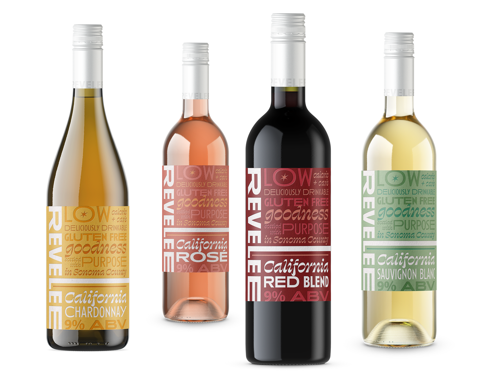
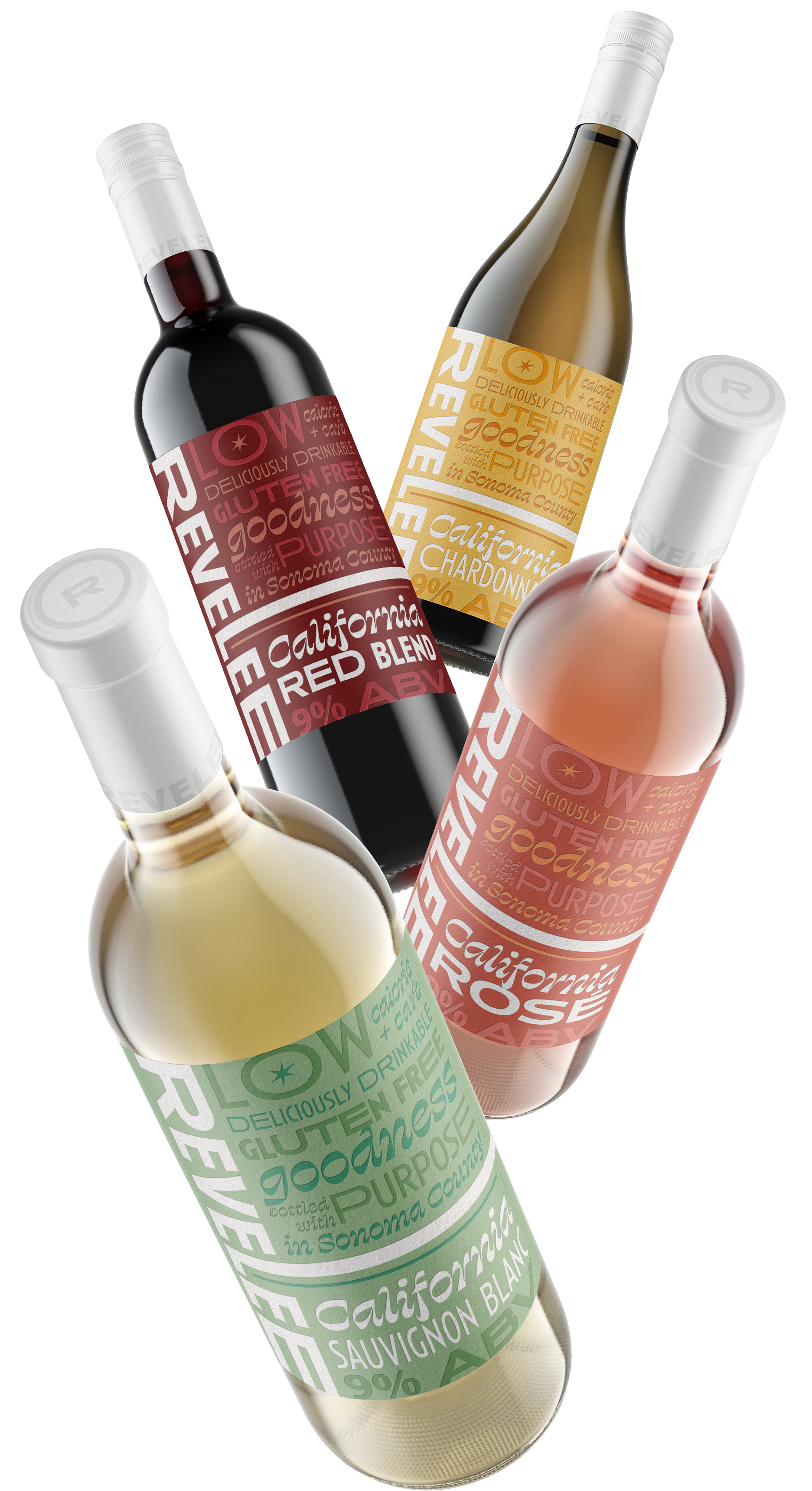
There are a growing number of low-alc wine options, but most of them don’t really look (or taste) like something a wine lover would be excited about. Foley Family Wines developed a line of lower alcohol wines that actually taste… like wine. Their challenge was to develop a wine brand and packaging that could break through a category filling up with ‘health and fitness wines’ and organic marketing clichés: something that could be clearly distinct, but still speak to afficionados looking for a lighter option for their everyday pour.
Revelee is unapologetically bold, but adds a level of unpretentious sophistication that the category seems to be missing. I focused on developing a brand ID and packaging suite that embraces transparency, and an unfussy tone. It is meant to invite people to explore something different, while implying that healthy choices don’t have to be a sacrifice.
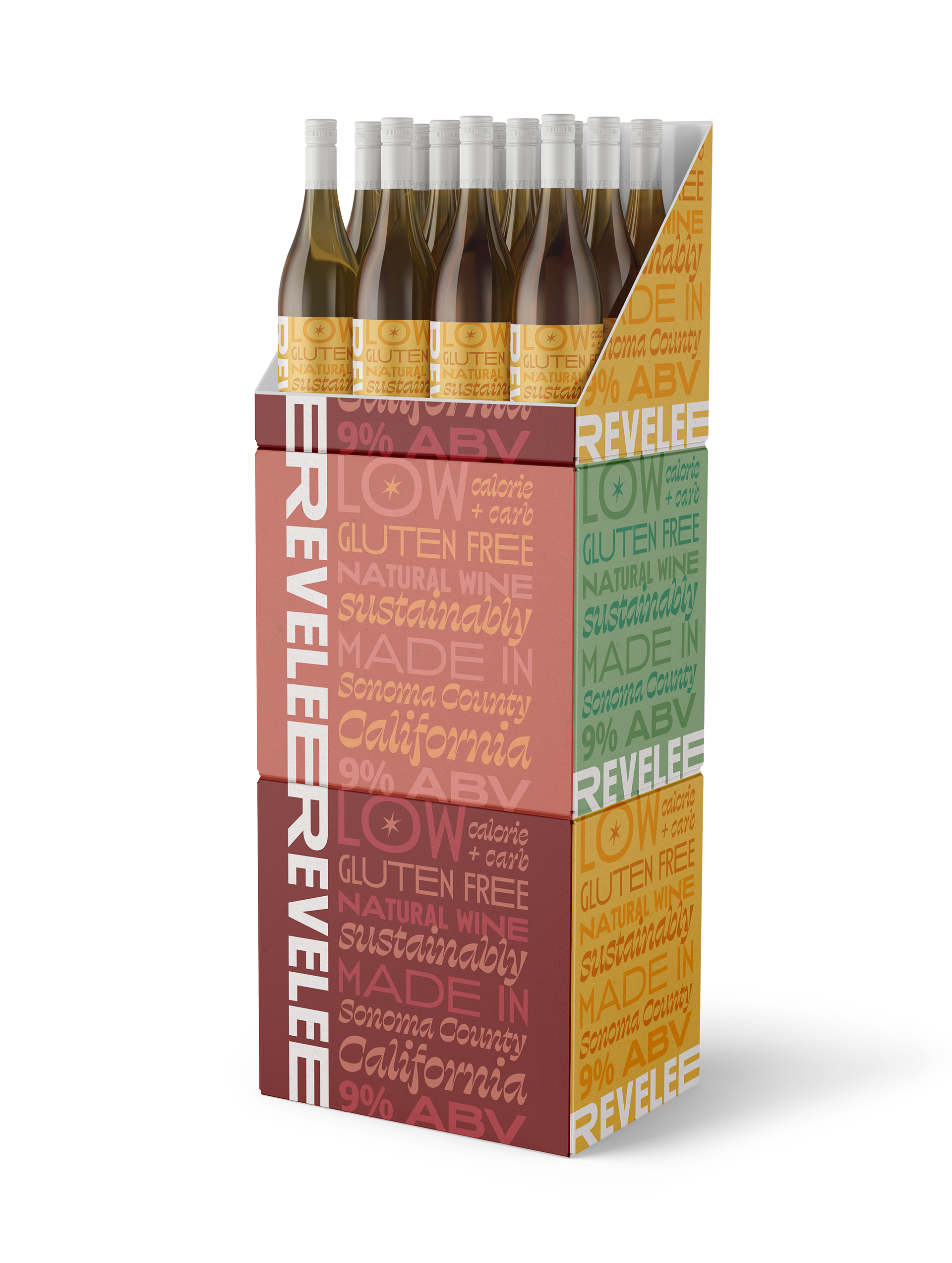
concept art direction
packaging design
Revelee was a Graphic Design USA 2024 American Package Design Awards winner.